- Регистрация
- 17 Февраль 2018
- Сообщения
- 25 397
- Лучшие ответы
- 0
- Баллы
- 2 093
Offline
Maybe I've been too hard on widgets. Ever since they appeared in the macOS X dashboard, I've thought of them as a nuisance – tiny memory hogs that only exist to disappoint me with their limited functionality. Microsoft took a cue and brought them into Windows Vista, and now they’re back in Windows 11. Widgets are harmless, I know. But every time they’ve showed me the weather, or reminded me of an upcoming appointment, I’ve wished for a world where they didn’t disrupt the sanctity of my desktop experience.
Now I wouldn't say macOS Sonoma made me a total widget convert. But, at the very least, it's made me more tolerant of them. The new widget experience is a minor, but helpful quality of life upgrade – something that basically describes macOS Sonoma as a whole. There aren't any major new features like last year's Ventura, which brought over Stage Manager from iPads. But Sonoma shows that Apple can still come up with new ways to make its desktop OS more pleasant.

Photo by Devindra Hardawar/Engadget
You must widget
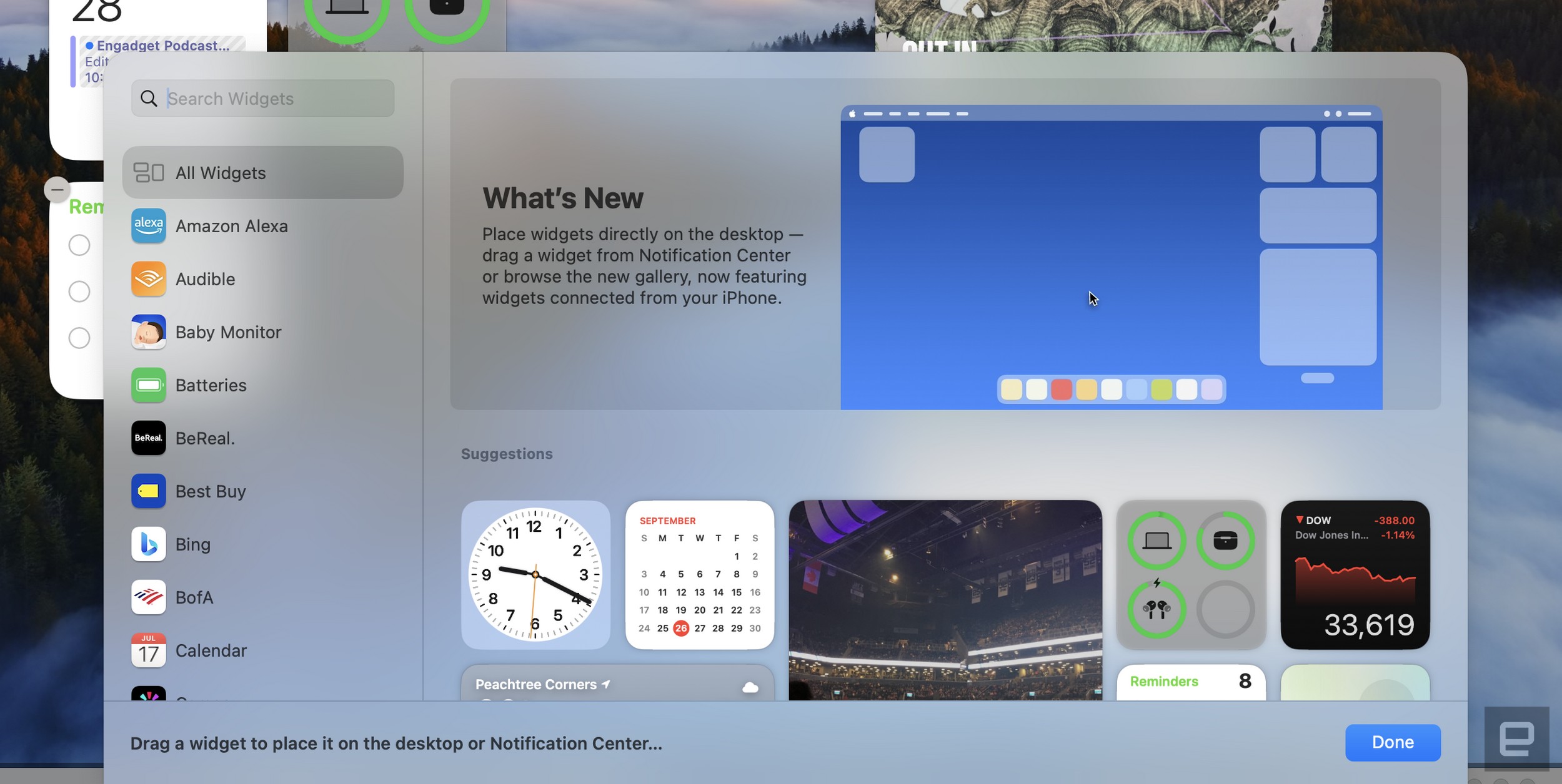
While you can still access widgets in macOS Sonoma's notification center, something you could do for years, I never found that placement too compelling. My Mac isn't like my iPhone or iPad, where I'm always trying to keep up with the latest alerts. I'm usually focused on getting some work done. By bringing widgets out of the side bar and onto the desktop, Sonoma integrates them far more organically.
Now, you don't have to go out of your way to get a quick weather update, or to see the battery levels of your Apple devices. Your widgets are just always sitting there, ready for a quick glance whenever you close a few windows or expose the desktop (something I do frequently with hot corners). Apple also revamped many of its existing widgets to take advantage of the additional screen space.
Another new feature: You can bring over widgets from your iPhone (assuming it's signed into the same iCloud account as your Mac, and is also on the same Wi-Fi network). Those have been hit or miss, in my experience. They often take a while to load properly on your desktop, and if you interact with them, they either redirect to a website or tell you to open their iPhone app. When I enabled Spotify's iPhone widget on Sonoma, for example, it showed me the track I'm currently listening to, but that's it. As soon as I touched the widget, it said I had to open Spotify on my iPhone to continue.
That wonkiness could be smoothed over if more developers start building macOS widgets. But Apple has been trying to make widgets a thing for years with little success. Maybe they'll have more success now that widgets aren't hidden away in a corner.

macOS finally gets serious about gaming
Historically, Apple has never really been a gaming-focused company. But with Apple Arcade and the unstoppable success of the mobile App Store, not to mention its own growing CPU and GPU prowess, the company has finally started to lean into games over the last decade. Now with macOS Sonoma's Game Mode, Apple also has a way to focus its hardware to deliver the best performance possible.
It's well-timed too, as we're also seeing recent titles like Lies of P and Resident Evil Village make their way to the App Store. Some Steam offerings, like Tunic, Disco Elysium and Inscryption, also include Mac support. Game Mode won't magically turn your Mac into a superpowered rig, but it'll help achieve better framerates and lower latency by prioritizing what you're playing.
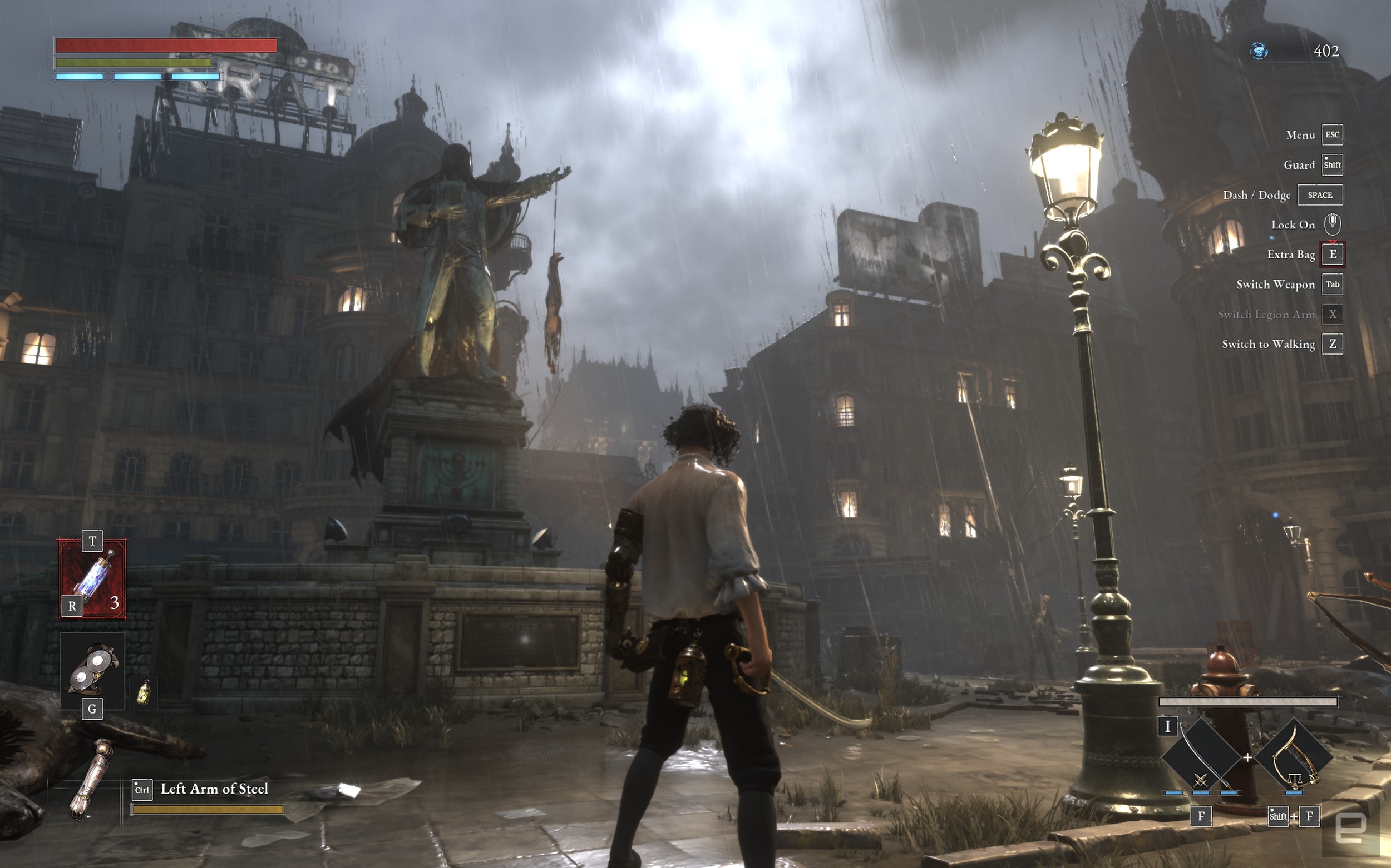
Based on an hour of playing Lies of P on an M2-equipped 13-inch MacBook Pro, Game Mode helped to deliver a smooth, console-like experience. The game appeared to be hitting near 60fps while playing with medium settings at a 1,920 by 1,200 resolution, though it occasionally slowed to a 30fps crawl in expansive outdoor environments. Latency with my 8BitDo Ultimate controller felt minimal over Bluetooth, and I was also surprised that the game performed just as well on battery power.
Sonoma's Game Mode won't make me an all-Mac gamer anytime soon, but it's a nice feature to have, especially if you don't have access to consoles or PCs with beefy GPUs. It would also be nice to see cloud saves for native Mac games that can synchronize with other platforms. (Dead simple cloud saves are a major reason why I lean on Steam as my primary gaming storefront.)

Apple
The best screensavers ever
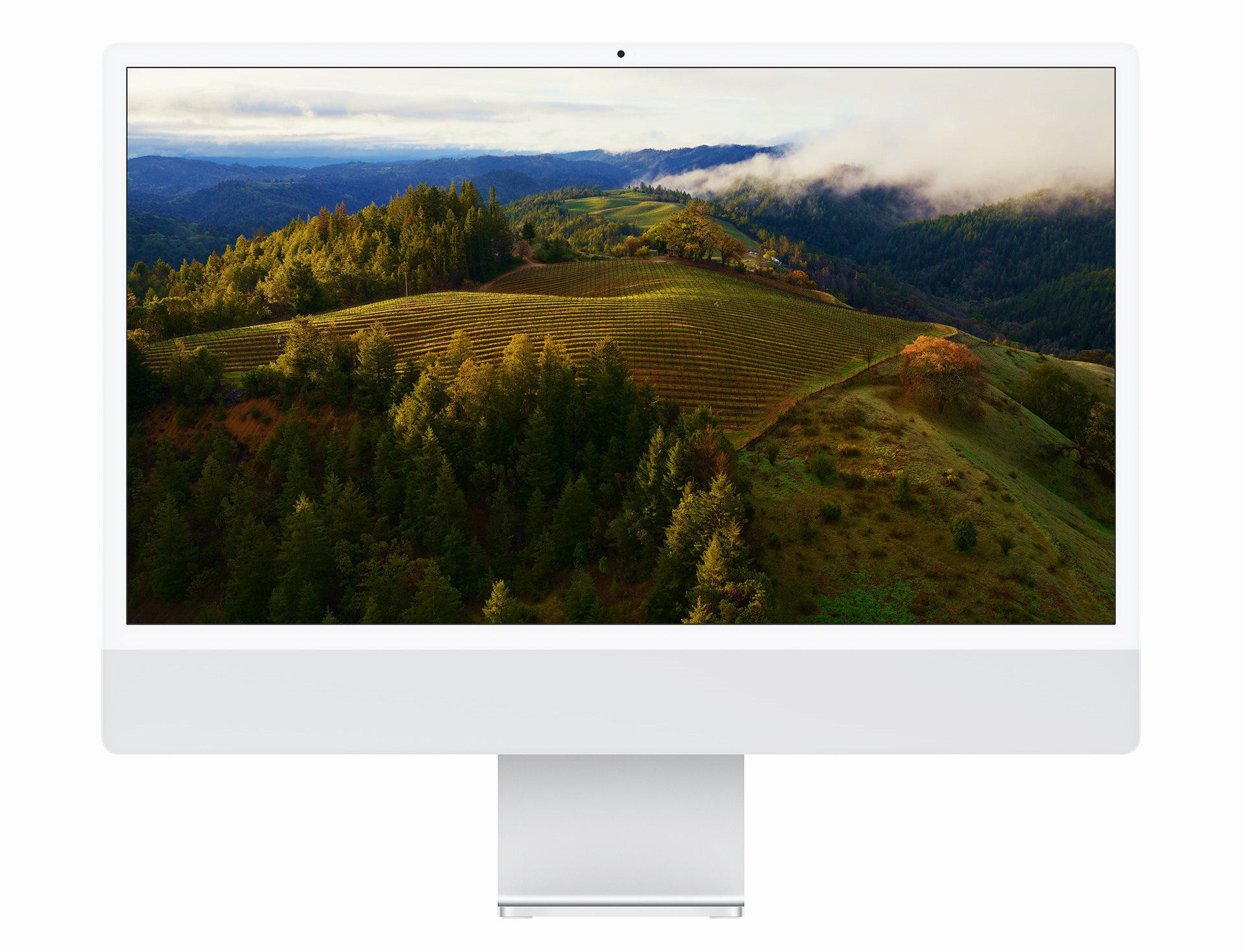
I wasn't super excited to see macOS Sonoma's aerial screensavers at first, mostly because I've been getting my fill of that lovely drone and helicopter footage since it debuted on the Apple TV in 2015. But in my months with the Sonoma beta, I've learned to appreciate them. Occasionally when I'm lost in thought (and probably trying to finish a review), an aerial screensaver will flip on and deliver a calming view of Hong Kong's cityscape, or the fog over Sonoma Valley. It's like a free brain massage, something that lifts me out of the daily stress of work, kids and home maintenance.
No matter how many times I see it, I still get a kick out of seeing aerial screensavers slowly pause to a stop and transform into my wallpaper. It's purely aesthetics, but it's the sort of thing few companies would spend much time on.
This article originally appeared on Engadget at https://www.engadget.com/macos-sonoma-review-widgets-gaming-141540494.html?src=rss
Now I wouldn't say macOS Sonoma made me a total widget convert. But, at the very least, it's made me more tolerant of them. The new widget experience is a minor, but helpful quality of life upgrade – something that basically describes macOS Sonoma as a whole. There aren't any major new features like last year's Ventura, which brought over Stage Manager from iPads. But Sonoma shows that Apple can still come up with new ways to make its desktop OS more pleasant.
Photo by Devindra Hardawar/Engadget
You must widget
While you can still access widgets in macOS Sonoma's notification center, something you could do for years, I never found that placement too compelling. My Mac isn't like my iPhone or iPad, where I'm always trying to keep up with the latest alerts. I'm usually focused on getting some work done. By bringing widgets out of the side bar and onto the desktop, Sonoma integrates them far more organically.
Now, you don't have to go out of your way to get a quick weather update, or to see the battery levels of your Apple devices. Your widgets are just always sitting there, ready for a quick glance whenever you close a few windows or expose the desktop (something I do frequently with hot corners). Apple also revamped many of its existing widgets to take advantage of the additional screen space.
Another new feature: You can bring over widgets from your iPhone (assuming it's signed into the same iCloud account as your Mac, and is also on the same Wi-Fi network). Those have been hit or miss, in my experience. They often take a while to load properly on your desktop, and if you interact with them, they either redirect to a website or tell you to open their iPhone app. When I enabled Spotify's iPhone widget on Sonoma, for example, it showed me the track I'm currently listening to, but that's it. As soon as I touched the widget, it said I had to open Spotify on my iPhone to continue.
That wonkiness could be smoothed over if more developers start building macOS widgets. But Apple has been trying to make widgets a thing for years with little success. Maybe they'll have more success now that widgets aren't hidden away in a corner.
macOS finally gets serious about gaming
Historically, Apple has never really been a gaming-focused company. But with Apple Arcade and the unstoppable success of the mobile App Store, not to mention its own growing CPU and GPU prowess, the company has finally started to lean into games over the last decade. Now with macOS Sonoma's Game Mode, Apple also has a way to focus its hardware to deliver the best performance possible.
It's well-timed too, as we're also seeing recent titles like Lies of P and Resident Evil Village make their way to the App Store. Some Steam offerings, like Tunic, Disco Elysium and Inscryption, also include Mac support. Game Mode won't magically turn your Mac into a superpowered rig, but it'll help achieve better framerates and lower latency by prioritizing what you're playing.
Based on an hour of playing Lies of P on an M2-equipped 13-inch MacBook Pro, Game Mode helped to deliver a smooth, console-like experience. The game appeared to be hitting near 60fps while playing with medium settings at a 1,920 by 1,200 resolution, though it occasionally slowed to a 30fps crawl in expansive outdoor environments. Latency with my 8BitDo Ultimate controller felt minimal over Bluetooth, and I was also surprised that the game performed just as well on battery power.
Sonoma's Game Mode won't make me an all-Mac gamer anytime soon, but it's a nice feature to have, especially if you don't have access to consoles or PCs with beefy GPUs. It would also be nice to see cloud saves for native Mac games that can synchronize with other platforms. (Dead simple cloud saves are a major reason why I lean on Steam as my primary gaming storefront.)
Apple
The best screensavers ever
I wasn't super excited to see macOS Sonoma's aerial screensavers at first, mostly because I've been getting my fill of that lovely drone and helicopter footage since it debuted on the Apple TV in 2015. But in my months with the Sonoma beta, I've learned to appreciate them. Occasionally when I'm lost in thought (and probably trying to finish a review), an aerial screensaver will flip on and deliver a calming view of Hong Kong's cityscape, or the fog over Sonoma Valley. It's like a free brain massage, something that lifts me out of the daily stress of work, kids and home maintenance.
No matter how many times I see it, I still get a kick out of seeing aerial screensavers slowly pause to a stop and transform into my wallpaper. It's purely aesthetics, but it's the sort of thing few companies would spend much time on.
This article originally appeared on Engadget at https://www.engadget.com/macos-sonoma-review-widgets-gaming-141540494.html?src=rss
